Friday, December 25, 2009

2k50: An Experimental Project


I've been working on a personal side project called "2k50: The 50 Best Songs of the Decade," which just went up a few days ago. I spent weeks compiling my 50 favorite songs of 2000-2009, and am now posting 5 more every day until December 30 (50-26 are up as of this writing). This project also served as an opportunity to further explore Wordpress as a site management solution. It worked wonderfully, and has given me a lot of insight into how to build sites that clients can update themselves even if they don't know how to code. Furthermore, I even learned a new thing or two about CSS layouts. This may not mean much to those who don't know coding, but I was able to design the site using solely text and CSS-scripted boxes of color -- this is a great technique in general as it not only makes pages load faster, but improves searchability.

Check it out: 2k50: The 50 Best Songs of the Decade

Monday, December 21, 2009

New work up: Duracell.com


A few months ago I was on the team redesigning Duracell's website, with my focus on the user experience side of things. The wireframes I worked on (which were partially based on designs another interaction designer had created - I certainly can't take 100% credit!) were used by the creative and tech teams to implement the site. I'm pretty happy with the end result!

Visit Duracell.com

Tuesday, November 24, 2009

Removing ego from design

One of the most difficult aspects of any web design project is reconciling the goals of the designer with the goals of the audience. (And by "designer," I am including everyone involved in the design process, including the client, the design agency, etc.) This is so difficult because the goals of the designer include so many facets -- the client wants to get more money coming in, the agency wants to please the client to get more work in the future, the creative director wants to wow other creative types with his/her vision and maybe win an award, etc. And amidst all of that as well are political power plays, internal arguments, and some "selective hearing" when it comes to research and statistics that don't support their individual goals. (I speak of no particular agency or experience here -- these are accumulated observations.)

The whole rigmarole can be a bit exhausting and it is very easy to get caught up in the "designer" side of things. It all seems quite serious - to step back and think about the fact that people can get into shouting matches over a single word on a website (I've seen it happen) - I don't know, it seems like the perspective is off. People take these battles very personally, and fight for things because they want them, or because it means something to them, and it's easy to forget that all that really matters is whether or not somebody going to your website is going to have a good experience.

This is why I've found it so valuable, in my own work, to start viewing the work I do as completely separate from who I am. Much of what I design is based on research - knowing what works and what doesn't - but there is not enough research in the world to make every decision foolproof. If something was a subjective call, or I designed based on a hunch, and someone takes issue, I'll explain my viewpoint but recognize that if I don't have an empirical study to back it up, it's really just an opinion.

In addition, when working in a group environment, letting go of ego can make the brainstorming and overall creative process a lot more open. An idea prefaced with "this may be stupid, but..." could end up being the best idea of the day, while one that someone thinks is surefire could be quickly tossed out as the details are thought out further. When ego is involved, the initial "stupid" idea might never be brought up for fear of a negative reaction, while the "surefire" idea might be fought for tooth-and-nail to the detriment of better options. Letting go of ego - where you perceive comments about your idea as a comments about you - switches the emphasis to the ideas, not the people.

This ends up being quite liberating in the long run, because not only does it make it easier to edit and adapt your design as more learnings come in, it also makes you focus more on what will best serve the end user. And in the end, that's really the truest measure of a successful design.

Friday, November 20, 2009

The best restaurant site I've seen in a long time

I live not too far from a little pizza place called Emilio's. The other day I was looking through the handful of delivery menus I have and realized I didn't have one for Emilio's, so I figured I'd check online to see what they had.

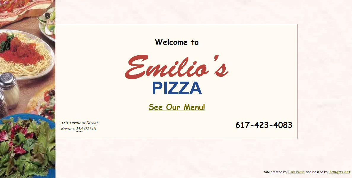
It took a few clicks to find their site (Google didn't surface it to the top like I'd hope), but once I did, I practically jumped up and down for joy. This one page is their whole website:


(Click to enlarge it, or just visit it here: www.emiliospizzaboston.com)

Okay, so, obviously this is not the prettiest website, but from a usability standpoint I was so happy to see an eatery get it right for once. There are pretty much three main reasons why you'd want to visit a delivery restaurant's website:

-What's on their menu? (And how much does it cost?)
-Where are they located?
-What's the phone number to place an order? (Or for fancier restaurants, to make a reservation)

What does the site for Emilio's offer? A direct link to the menu, their address, and their phone number in large text. No marketing gobbledygook statement from the owner. No pages about atmosphere. No unintuitive naming conventions (everyone knows the word "Menu," so calling it "Food" or "Cuisine" or something cutesy like "Tasty Nibbles" just ends up being confusing).

And furthermore, finding the menu didn't require me to click a location, then click a time of day (brunch, dinner, etc.), then click further into another sub-set of pages for "appetizers," "entrees," etc. I just got the whole menu right away, which is exactly what I wanted.

There are definitely more things the site could offer that would be helpful - hours, a link to a map next to the address, maybe a picture or two of the place (and if it was a fancier restaurant, probably information about reservations and maybe some press reviews), but the essentials were right there. It could also certainly be more visually appealing, but the fact is I found exactly what I was looking for within a split second of landing on the site, which is worth so much more than looking pretty.

Wednesday, October 21, 2009

Progressive disclosure: making decisions easier and more satisfying

I'm not sure if I've directly used the term on this blog before, but the concept of "progressive disclosure" is (in my opinion) a very important part of good design for any website or application. A good design will help the user find what they're looking for easily. Some people interpret this as meaning you should present up-front every possible piece of information they may need or want. In reality this just confuses the user. Imagine if, when you landed on Amazon's website, you were given a full list of every single product with full product description all on the home page. It would be completely unwieldy and almost impossible to find what you really want. Does "everything up-front" still sound like a good plan?

Progressive disclosure tells you that the best way to get people the information they want is to provide just enough at any given point to help their get to their desired result. To continue with the Amazon example, let's say you wanted to buy a Samsung HDTV. In our "up-front" example, you'd have to scan through an unwieldy page with millions of products to find what you want. Instead, progressive disclosure lets us get the shopper to Samsung TVs by clicking through a hierarchy. "Electronics," then "Televisions & Video," then "Samsung" is highlighted as a brand.

Furthermore, when you land on the Samsung page, you don't just see a text list of products or a full spec sheet for each product. You see each product with its name, an image, its price, and its consumer star rating. You're not given the full list of specs and item description for each item, but you're given extremely quick glances at three major pieces of information - aesthetics, price, and quality - which can then help you narrow down to the selection you want.

There are a lot of other ways of using progressive disclosure that aren't just hierarchical. It is helpful also in stepped processes, such as a shopping cart checkout (often you'll see steps shown, such as "Choose Payment Method" and "Enter Shipping Address," with your current step indicated). This lets the user know what's coming next and how long the process is.

You can also use the concept for things like optional features, such as when you are uploading a photo to a site. You may just want to put the photo up and leave it at that. Or maybe you want to add a caption, or tag people in the photo, or edit the photo, or assign it to an album. Having all these options shown up-front can be overwhelming, particularly to the user who just wants to put a photo up right away, a better method would be to make the most commonly used options visible and then hide some of the less-often used features behind a tab or link called "Customize" or "Edit" or something similar.

If you are already in the user experience field, this is probably nothing new. But it seems a lot of clients are frequently unaware of or even fearful of the concept. "I have this great [product/event/etc.] with all these amazing features and aspects to it, I want people to get excited and know all about how awesome it is! Why wouldn't I tell them all about it as soon as I can?"

The answer is that it doesn't help you if you overwhelm or turn off your potential audience. The above quote comes from a perspective of what the company/organization wants, not what the customer does. What your customers probably want to do is figure out what they are interested in, and then learn more about it. (How would you feel if the moment you walked into a car dealership, the dealer gave you a stack of spec sheets and owner's manuals for every car on the lot before you'd even looked at one? Wouldn't you rather find some cars that interest you and then get ask for more information?)

On any given page of a website, ask what the purpose of the page is and why the visitor may be there. Is it a list of products? They are probably there because they are trying to decide or find a product they want. Provide just enough information to get them to a good match, and then on that product's page give them the full run-down.

There are a lot of adjacent concepts that are relevant as well. "Information scent" is the practice of making sure links are providing just enough information to make the user feel like they are on the right track. And the "paradox of choice" is a concept that it is typically much easier, and much more satisfying, to make a choice from among a handful of options than hundreds of options. You could show 512 choices on one page, or you could add a measly 2 clicks to the process by placing a couple hierarchical categoies of 8 options each, giving your customer a much happier path to their goal.

Don't be afraid that you are going to lose a customer by making them click a few times to find what they're looking for. In reality, you are creating an easier and more satisfying route to guide them.

Monday, August 10, 2009

Offer an answer before the question gets asked


I'm going to give Bank of America a thumbs up and a thumbs down for two recent changes that raised my curiosity.

First, the positive. Bank of America (and a few other accounting/banking sites I've seen) seem to be switching to sign-in process that involves entering your username on one screen, and then your password on the next screen, rather than doing both at once. I don't know the research behind this, but my assumption is that this must be a more secure way of managing the login.

However, the first time I noticed that I wasn't being asked for a password, I got concerned. Did that mean that now someone only needed my username to access my account? It raised an alarm. However, right below the username field I noticed a link that said "Where do I enter my passcode?" Even without clicking the link, my concerns were relieved, because it was clear just by providing the link that I would, indeed, enter my passcode at some point to sign in. This is an example of smartly predicting a user's question and providing an answer without them having to ask. It saves the company time and money by reducing customer service requests, and it reinforces the user's confidence by being transparent and anticipating their questions.

Now the negative. I recently deposited a somewhat large check in my account. The pending deposit showed up immediately on my online banking. A few days later, however, a negative "deposit hold" for a slightly different amount appeared. Had it been the identical amount to my deposit I would have been less worried, but the fact that it was a different number, and that it was showing as a separate debit to my account rather than just a note on my original deposit, had me concerned that someone had somehow erroneously withdrawn that money from my account. There was no additional information, and even a search through customer support gave no explanation of a "deposit hold." I suspected things were probably fine and it was just an odd line-item while waiting for my deposit to clear, but to be sure I sent a message to customer service. They eventually confirmed that it was just a note until my deposit fully cleared and not to be worried.

However, they missed two key opportunities to provide information in advance, left a customer worried for a few hours, and ended up expending the time/cost involved in responding to an individual customer request. Had they included a clearer note with the "deposit hold," or even at least had an easily searchable answer in their customer support, they would have saved money and prevented any cause for concern.

I've seen similar examples of anticipating questions/concerns online, such as ING Direct adding a simple disclaimer to accompany a slight site redesign: "We gave our site a minor facelift. So if you notice anything different after you sign in, don't freak out. You're in the right place." Another smart move.

Anytime you are designing for the web, it's smart to brainstorm what questions your users might have, and to make sure the answers are provided or easily findable in advance. It's a win-win addition.

Monday, June 29, 2009

Typical can be good

Anyone working in a creative field will feel, from time to time, a little bored. It may feel like you've done the same thing before, and it feels like you're going through the motions. "This just feels so typical." So you try to shake things up by doing things differently, by starting from scratch, deliberately avoiding the way you've done things before.

That's good, right?

Well... not necessarily, particularly in web design.

While creative people may get bored, most people -- your consumers -- tend to resist change. Change is uncomfortable and unexpected. We operate on muscle memory a lot -- most web visitors know to click a logo for the home page. Most people know how tabs work. Most people understand a dropdown menu.

When you start changing those fundamentals, you're forcing people to learn something new, you're breaking well-entrenched habits, and you are putting your visitor in a position of unfamiliarity.

You can try to push past the typical in many aspects of design, just don't forget that the visitor is probably coming to your site to get something done, and they will accomplish that better if, at least at the interaction level, the design follows standards they are familiar with and have used before. Typical is often actually the best way to go.