Tuesday, February 1, 2011

Do one thing right

I love this post about file storage service Dropbox:

Well, let's take a step back and think about the sync problem and what the ideal solution for it would do:

  1. There would be a folder.
  2. You'd put your stuff in it.
  3. It would sync.

They built that.

Why didn't anyone else build that? I have no idea.

"But," you may ask, "so much more you could do! What about task management, calendaring, customized dashboards, virtual white boarding. More than just folders and files!"

No, shut up. People don't use that crap. They just want a folder. A folder that syncs.

"But," you may say, "this is valuable data...certainly users will feel more comfortable tying their data to Windows Live, Apple Mobile Me, or a name they already know."

No, shut up. Not a single person on Earth wakes up in the morning worried about deriving more value from their Windows Live login. People already trust folders. And Dropbox looks just like a folder. One that syncs.

"But," you may say, "folders are so 1995. why not leverage the full power of the web? With HTML 5 you can drag and drop files, you can build intergalactic dashboards of stats showing how much storage you are using, you can publish your files as RSS feeds and tweets, and you can add your company logo!"

No, shut up. Most of the world doesn't sit in front of their browser all day. If they do, it is IE 6 at work that they are not allowed to upgrade. Browsers suck for these kinds of things. Their stuff is already in folders. They just want a folder. That syncs.

That is what it does.

This is the same kind of thing the folks at Signal v. Noise have been talking about for years.

People who have never designed complex commercial websites may not realize the headache-inducing number of special considerations you need to take into account. For any given product there may be a million unusual scenarios you have to plan for -- and many projects get bogged down with the vast majority of time and energy being spent on fixing issues that may affect fewer than 5% of visitors. Think about that -- spending only a small portion of time on a project for the part that affects 95% of people! Few things frustrate me more than realizing I've fallen into that particular rabbit hole.

The Dropbox tale is a good reminder of how simplification at every level is ultimately much more successful than trying to accomplish every possible goal for every possible customer. Dropbox was willing to say, "we are not the product for the person who wants a corporate-skinned RSS feed of multi-folder data backups." And they beat the competition by a mile.

Friday, January 21, 2011

Year 30: Fitness

I've decided to try to get back into blogging. As limiting myself to just design-related posts ended up yielding a rather slow stream of posts, I'm going to expand to cover all sorts of stuff.

I recently turned 30, and like many people, I felt like this was a milestone that deserved a little introspection. I've decided to refocus on some things that have been important to me. The first thing is my health and fitness.

I've been on a new fitness plan/diet since January 2, and I waited until today to post about it because I was waiting for a major milestone: I've officially lost 10 pounds already.

First, a little background -- I've never been fat or scrawny, but instead have vacillated in roughly the same 30-lb. weight range for half my life. I was 185 lbs. when I was 15 (I was already at my full height of 5'11"), and started realizing that was maybe a little big for me. I changed my diet and began exercising and within a year was down to 155. Through high school and college it slowly climbed back up to 175, and then for some reason in the first couple years post-college I lost about a pound a month until I was down to 152. At this point, I genuinely was too thin, and I decided to finally join a gym. Having built some muscle I ended up reaching the peak of my fitness around age 25, weighing around 160-165 lbs. and even had some slight ab definition in the right light. But in the years since I've gained some back and have mostly been 175-185.

This past fall I sort of "fell off the wagon" in terms of exercise and not only was I back at my peak weight, I am fairly certain I had lost some muscle. Basically I looked the worst I'd ever looked and wasn't happy about it. I then learned about the Four Hour Body by Tim Ferriss, and was particularly enticed by three major points: you get a day off each week to eat whatever you want, on other days you do not have to limit portions as long as you stick to "approved" foods, and apparently the whole thing works fast. (He claims you can lose 20 lbs. of fat in one month.)

So I decided to do it, but waited until the day after New Year's so I could ride out the holidays without watching what I ate.

The diet is pretty simple to remember but is quite restrictive. You can eat anything from these three groups but nothing else:

1. Proteins (meat, poultry, fish, eggs, tofu, etc.)
2. Legumes (beans, lentils, etc.)
3. Non-starchy vegetables (mostly greens -- no potatoes, for example)

That's it. This is hardcore low-carb (the only carbs allowed are basically beans -- not even brown rice is okay) and doesn't even allow eating fruit (other than tomatoes) because of the fructose (sugar) in it. No alcohol, aside from a couple glasses of red wine. You're not even supposed to consume artificial sweeteners (aspartame, Splenda, etc.) as they trigger some of the same chemical responses in the body that real sugar does, basically telling your body that you should store calories as fat and increasing your hunger. One day a week you are required to eat whatever you want all day -- not just allowed, but required -- as this "reboots" your metabolism to prevent it from thinking you are on a starvation diet.

This diet was especially hard for me because I am the pickiest eater you'll ever meet. "Oh I'm worse," you say? No, you're not. Of those three things allowed above, the only thing I ate was the protein part, mostly in the form of insane amounts of chicken. I could go into more detail, but just trust me -- everyone I've met has been flabbergasted by my limitations with food (a lot of things actually start to make me retch).

This is part of why I picked this diet, though. It was forcing me to try new things that are healthier for me. The first week of the diet was painful. The vegetables I tried were mostly terrible, and I was only able to really stomach some spinach being tossed in with the few things I actually liked. I tried a variety of beans and found them barely edible but mostly unpleasant. I was eating chicken, eggs, and turkey bacon constantly, as some of the few "recognizable" foods I was allowed. I was aching badly for my first "binge day" when I could revisit the foods I loved. And yet, I was surprised to find my hunger greatly diminished very quickly. Something about the carbs in my diet (I used to eat a LOT of whole grains -- shredded wheat, oatmeal, whole wheat bread, etc.) had made me feel like I could eat non-stop. The new diet was painful, but it was changing my appetite, and in that first week, I lost 5 lbs. It was working, but I wasn't sure if I'd be able to survive week 2.

Realizing 5 lbs. was nothing to sneeze at, I relished my binge day and then decided to try the diet again for another week. I found myself doing the previously unthinkable -- searching across the grocery store for new legumes, soups, vegetables, and seasonings that would fit in the diet. If I was going to have to eat like this, I was going to find foods that I didn't just tolerate but actually liked. And somehow, things started turning around. I realized that since bacon was okay, I could add it to a salad. I tried mixing beans with my favorite marinara sauce. I learned that cooking lentils with soy sauce outweighed their natural flavor and made them tastier. Things began looking up. In week 2 I lost another 3 lbs.

Week 3 wasn't even a question -- after my second binge day I felt ready to hop back into things and was actually starting to (gasp!) enjoy some of these new foods. I've eaten 2 salads pretty much every day this week, and although at first the weight loss seemed to be plateauing, I am down two pounds and still have one more weigh-in tomorrow morning before the official week count is up.

I'm a little more than halfway to my total weight loss goal, and it's exciting. The plan includes some other elements -- supplements and vitamins, lots and lots of (cold) water, and three 30-45 minute weight training workouts a week (which is actually less than I used to do as recently as this summer) -- but it was the diet that I knew would be my biggest challenge.

Why am I sharing all this? Well, first, I'm proud that I have been able to actually lose some weight, but mostly I'm proud that I've finally been able to bust out of my old patterns and expand my diet to include healthier foods. Once I reach my goal (and I'm fairly certain I will), I may even share my before-and-after pictures. And at that point, I'll move into "phase 2," which will switch from weight-loss to muscular fitness and involve some other beneficial changes.

I will say, if you are looking to lose some weight yourself, most diets will work -- if you stick to them. And this is where almost everyone fails. What I think differentiates this one is that it is somehow both one of the most restrictive and one of the most freeing, by balancing the diet limitations with a weekly day off, and does not require you to ever feel hungry. I had tried low-carb diets before and always felt deeply sad at the prospect of potentially never eating some of my favorite foods again (pizza, chocolate, and oddly, shredded wheat). There is no feeling of that here. I'm never starving, I don't have to count calories, and I always know that whatever I want to eat is just a few days away.

And still, I've lost more weight faster than I ever have before. I hope I can keep it going!

Thursday, May 27, 2010

Websites are not applications (...usually)

One of the increasingly blurry lines in the online world is the concept of websites vs. applications. Since the rise of the iPhone and its app store (and the corresponding app markets for platforms such as Android and Blackberry), the word "app" has rapidly spread into the mainstream. This is largely a distinction of marketing -- an "app" is really no different from what we've previously called "programs," "software," or even "games." But it also has started to overlap with the definition of "website."

For example, think of something like Google or Facebook -- these are websites. But they can also function as applications -- tools that you use often. And indeed, both have released "apps" for platforms such as the iPhone. But whether you use them in "app" format or "website" format, they function pretty much the same. The primary difference, really, is that an app is catered to the particular device you are using (although, with browser detection capabilities, a website can cater itself to your device as well).

The problem with this increasing overlap is that a lot of companies are misunderstanding what it means to have an "app," and they don't think about why other companies even have (or need) apps in the first place. I suspect a lot of people see the "social media" revolution and the increasing dominance of smart phones, and think they need to get in on it -- Make an app! Integrate with social media! Create user profiles and personalize based on each individual person! It's a marketing mantra that seems sensible -- reach your customers where they are rather than forcing them to come to you. So if Google and Facebook are websites, and they have apps, if I have a website, I should have an app too, right?

Well, no, not necessarily.

The fact is, most websites are NOT social media hubs or tools. Most websites are standalone pieces that people may visit once in their whole lives, or perhaps once every few months or so at a maximum. You might visit a furniture website when shopping for a couch and never come back. Maybe you need an exterminator and find them online, and then you never need them again. Perhaps you're going on vacation and check out a spa online at your destination, which you might never visit again. These are websites that deliver value at the time you use them, but you're not going back again very often (if ever). You're not going to make that exterminator's website your home page. You're not going to download the spa's app. And you're probably not going to set up a personal profile at a furniture studio's website.

But what about your favorite pizza delivery place? Your bank? Your favorite local clothing store? You might visit all of those places often, and would benefit from apps, profiles, or other long-term connections. Here's a few questions to ask yourself before you start thinking you need to be investing in these alternate methods of customer connection.

1. Do you provide a service or sell things that people tend to purchase frequently -- and can they make those purchases online?
If yes, you might benefit from an online profile that lets customers save their payment info and other preferences. You might also consider a simple mobile phone app that does the same thing.

2. Is there a useful (free) tool that you could provide online or via an app that your customers would use often and find valuable?
If yes, then you might benefit from providing an app or online tool. For example, I worked on Tide's "Stain Brain" website and app -- it gives tips for removing small stains on the go, which keeps Tide in the customer's mindset without requiring them to pay anything to use the app.

3. Does your business interact with the community in a way that engages people in a non-customer role (e.g., you sponsor a charity event with participants who aren't necessarily customers)?
If yes, then you might benefit from branching out via a stronger social media presence -- people are happy to support a cause by posting about it on Facebook or sending messages on Twitter to ask their friends to donate or help, and your name gets out there in the process.

If you can't answer yes to any of the above questions, there's a good chance you may not be in need of apps, social media, and user profiles. Any of those avenues done wrong can actually harm your image -- a useless app ends up looking like little more than an ad taking up space on your phone, a Twitter feed that is never updated just looks like you don't care about your business, and adding a user profile for a site you may rarely visit just frustrates the visitor and may serve as more of a barrier than a convenience.

So while everyone is shouting about the next wave of "customer enablement," keep in mind that it's not just whether or not you have an "app" -- it's a matter of whether or not that app (or profile, or Facebook page, etc.) actually offers any value to your audience.

Monday, April 19, 2010

When solutions create more problems

This will be a brief post, but it's been awhile since I've posted and I wanted to put something up, even if it was mostly an "aside."

THE PROBLEM
I listen to a lot of music and have several thousands of songs in my iTunes library. The problem with having so much music is that it can be hard to organize it and listen to songs I know I like while maintaining variety. If I only pick the songs I know I love, I end up just listening to a smaller and smaller subsection of the total library as it grows, leaving tons of songs sitting idly, unlistened. Yes, this is pretty mundane, but it is a problem I wanted to solve.

THE SOLUTION
One of the great aspects of iTunes is its "Smart Playlist" ability, where you can automatically generate playlists based on a number of factors. To re-introduce songs I hadn't heard in awhile, I created a playlist called "Listen Again." At first, I just set one parameter:

-Songs that I have listened to at least 10 times (showing that I liked them at some point) but haven't listened to in more than 2 months (showing I have forgotten about them).

This started off great, I started hearing songs again that I really enjoyed! But then another issue came up...

THE PROBLEM, PART 2
Some of these songs hadn't been listened to in 2+ months for a reason -- I didn't really like them all that much, or was already sick of them. As I continued to listen to the playlist, when I skipped those songs, they remained in the list, while the songs I liked automatically got booted off the list since they had now been played in the past 2 months. The result is that as time went by, the list became increasingly populated by songs I didn't want to listen to.

THE SOLUTION, PART 2
Well, lo and behold, there is another parameter I can use in iTunes to fix this!

-Songs that have been skipped at least once in the past month (removes songs I don't like, but allows them to return to the list in a month's time in case my taste changes by then).

Fantastic! The songs I skipped immediately got booted off the list. There are still two remaining problems, however...

THE PROBLEM, PARTS 3 & 4
I hadn't considered this until the playlist started cooking, but -- a lot of these songs haven't been played in 2+ months because they are Christmas-related songs! Whoops! There is no easy fix for this -- unless I go back and tag all those songs as belonging to the "Christmas" genre, and exclude that genre from the mix (which I may go and do later).

And then there's the biggest problem, really -- what to do with those songs that this playlist has allowed me to rediscover and enjoy? By virtue of being played, they are now immediately off the playlist! Is there another smart playlist I can create to capture them? This one I don't know how to answer. There may be a way to create a hybrid of songs that appeared on this and also were recently played, but I haven't figured it out yet.

Interestingly, iTunes offers several default smart playlists (recently added, most played, etc.) -- it'd be interesting to see if they expanded their default lists to include some similar concepts. Perhaps sparing users the work I just went through. They have made efforts with their Genius tool to expand your listening (which can also lead to expanding your buying), but I bet there's more that can be done.

Monday, January 25, 2010

New work up: JohnCorvino.com


http://www.johncorvino.com/

I met John Corvino in person several months ago, and after learning his partner worked in the same company as I did (albeit in the Detroit branch), we stayed in touch, and he asked me to take a look at working on his website. John is a prominent speaker/writer/lecturer on moral issues surrounding gay rights (hence the moniker "The Gay Moralist"). In fact, he debated Maggie Gallagher, president of the National Organization for Marriage, just last week.

For his site, he wanted to not only give it a clean, vibrant visual makeover, but also make it easy to update and provide an automated way to sign up for an email newsletter. I've found that virtually all clients at this point want the ability to update their sites themselves, and it can be tricky to build a site with a content management system that does not require any coding knowledge on the part of the person doing the updates.

For this execution, I did a slight restructure of the information architecture, and then used WordPress (which I also used for my 2k50 site) for the implementation. I wrote a visual theme for it from scratch and used the "Pages" and "Categories" features to organize the content. I also figured out a few other cool things -- I managed to sync up an RSS feed of the columns John writes for 365gay.com so they appear on his site automatically (and in the proper category). I also used a combination of WordPress plugins and Feedburner to build a free, automated email newsletter for him -- all within the same admin interface as updating site content.

I am finding that WordPress has a lot of benefits (although there are some unfortunate issues that require workarounds), and will probably continue using the service for similar clients in the future.

Check out John's site at http://www.johncorvino.com/.

Friday, January 22, 2010

Marketing-speak is killing me

A lot of my work involves looking at other websites to see what's going on in terms of structure, interactivity, etc. And one thing that I keep noticing is just how often websites are plagued by utterly-meaningless, corporate marketing-speak. Here's one example from a financial institution's home page:

What does that mean? I will give the copy writer a little benefit-of-the-doubt -- they at least understand that a major issue people have with financial institutions is trust, and being valued. The problem is that this says absolutely nothing about how they plan to establish that trust or "commitment." There is no action to take here. There is no proof of their claim. It would be like having a slogan that says "We are good" and leaving it at that without an explanation of why. Note that they don't even tell you what they do here -- the only thing that establishes any sense of financials is that the two guys in the generic stock photo are in suits. But they could be lawyers, politicians, who knows. And yet this is the largest piece of real estate on their website's home page. Who would be convinced of anything here?

I'll contrast this with a better example from a similar company:

This is a little better. I could still do without yet another generic stock photo, but I know that research shows people do respond to photos of other people, and at least the photo does roughly connote either retirement or saving for your child. But where this site gets it right is that it is establishing a bunch of things with its headline and copy very quickly. It tells you what the company does, how that can help you, how they accomplish that (including a product name), what it will mean for you, and then invites you to action. It's not just saying "we care about you." It's saying "we understand what your problem is and we are offering you this solution." Much more effective.

It's the old "show, don't tell" adage. It's a lesson too frequently forgotten.

Tuesday, January 19, 2010

Prioritizing Content

The field of "information architecture" is essentially about organizing. Where do things go? What's the hierarchy? You can't answer questions like this without first figuring out your content and prioritizing it.

This is extremely challenging for a lot of clients. It's like asking them to pick a favorite child. How can you say that product A is more important than product B? Or that one type of information is more important than another?

The reality, however, is that prioritizing is not optional. Even if you somehow designed a website where literally every single piece of information was given equal weight, you'd still have the bias of the order in which that is presented. Something neutral like "alphabetical" now gives weight to A-named things. Abandoning any particular order and randomizing every time you load a page now completely leaves the user helpless as they have no way to find anything as there is no structure anymore. You have to make a choice in terms of priority.

The good thing is that you don't have to make these decisions in a vaccuum. There are two key methods to determining priority: user goals and business goals. Fairly basic site statistics can tell you what your users are doing (more advanced analysis could of course give you additional insights). If 20% buy products, but 60% go to the help forums, you could probably surmise that the majority of your site visitors are existing owners of your product who come back to look for assistance (it also may suggest that your product has some problems!).

But hold on one second. If you followed that priority path, you would be greatly diminishing the prominence of shopping for your products. This may match user behavior but is probably not a great match for your business goals -- no doubt your top priority is selling your product. And this is where that delicate balance of both comes into play.

The key to managing both sides of the equation is understanding that users looking for particular things tend to exhibit different behaviors. Most people will probably expect that the main area of your home page will be promotional in nature. If they are coming in with the intent to get help with your product, they will probably start by looking in your menus, footer, or other contextual link areas searching for key words like "support," "help," or "FAQ." You can cater to them by making such a link highly visible and easy to spot, without sacrificing your promotional space for products.

Conversely, someone who is in a "shopping" mindset may skip your menus altogether and interact directly with your main content area. Further prioritizing here (showing the most popular products, for example, or the best new discount) gets that user to the content they're looking for right away.

This is all rather high level, I'll admit, and prioritization decisions are often much more difficult than this. Take, for example, a website with a homepage that has three clearly defined areas for promotions. If these three areas are different in size and location, you can probably give a clear order to their visibility. Let's say you have a large banner, a medium-sized tile area, and a small text link, going from "most visibility" to "least." Now let's say you have three new promotions coming up simultaneously. Your first instinct for each may be to give them all top priority. They are all important, right? Can't we just make three large banners? You could... but then your website would start becoming a monster with no organizational structure. It's never a good idea to re-structure a website based around a single one-time occurrence, unless it's something truly huge (like, you're going out of business, for example). You confuse return visitors and disrupt the visual "brand" your site establishes.

It becomes so much easier to solve design problems when you get comfortable with the idea that not everything is going to be equally important, and that the way to give visibility to content may differ based on the type of content you are presenting. Smart prioritization not only makes your website easier to navigate, it can increase user satisfaction and supports your business goals by steering people to the content they want while also giving them an easy path to turn from visitor into customer.

Friday, December 25, 2009

2k50: An Experimental Project


I've been working on a personal side project called "2k50: The 50 Best Songs of the Decade," which just went up a few days ago. I spent weeks compiling my 50 favorite songs of 2000-2009, and am now posting 5 more every day until December 30 (50-26 are up as of this writing). This project also served as an opportunity to further explore Wordpress as a site management solution. It worked wonderfully, and has given me a lot of insight into how to build sites that clients can update themselves even if they don't know how to code. Furthermore, I even learned a new thing or two about CSS layouts. This may not mean much to those who don't know coding, but I was able to design the site using solely text and CSS-scripted boxes of color -- this is a great technique in general as it not only makes pages load faster, but improves searchability.

Check it out: 2k50: The 50 Best Songs of the Decade

Monday, December 21, 2009

New work up: Duracell.com


A few months ago I was on the team redesigning Duracell's website, with my focus on the user experience side of things. The wireframes I worked on (which were partially based on designs another interaction designer had created - I certainly can't take 100% credit!) were used by the creative and tech teams to implement the site. I'm pretty happy with the end result!

Visit Duracell.com

Tuesday, November 24, 2009

Removing ego from design

One of the most difficult aspects of any web design project is reconciling the goals of the designer with the goals of the audience. (And by "designer," I am including everyone involved in the design process, including the client, the design agency, etc.) This is so difficult because the goals of the designer include so many facets -- the client wants to get more money coming in, the agency wants to please the client to get more work in the future, the creative director wants to wow other creative types with his/her vision and maybe win an award, etc. And amidst all of that as well are political power plays, internal arguments, and some "selective hearing" when it comes to research and statistics that don't support their individual goals. (I speak of no particular agency or experience here -- these are accumulated observations.)

The whole rigmarole can be a bit exhausting and it is very easy to get caught up in the "designer" side of things. It all seems quite serious - to step back and think about the fact that people can get into shouting matches over a single word on a website (I've seen it happen) - I don't know, it seems like the perspective is off. People take these battles very personally, and fight for things because they want them, or because it means something to them, and it's easy to forget that all that really matters is whether or not somebody going to your website is going to have a good experience.

This is why I've found it so valuable, in my own work, to start viewing the work I do as completely separate from who I am. Much of what I design is based on research - knowing what works and what doesn't - but there is not enough research in the world to make every decision foolproof. If something was a subjective call, or I designed based on a hunch, and someone takes issue, I'll explain my viewpoint but recognize that if I don't have an empirical study to back it up, it's really just an opinion.

In addition, when working in a group environment, letting go of ego can make the brainstorming and overall creative process a lot more open. An idea prefaced with "this may be stupid, but..." could end up being the best idea of the day, while one that someone thinks is surefire could be quickly tossed out as the details are thought out further. When ego is involved, the initial "stupid" idea might never be brought up for fear of a negative reaction, while the "surefire" idea might be fought for tooth-and-nail to the detriment of better options. Letting go of ego - where you perceive comments about your idea as a comments about you - switches the emphasis to the ideas, not the people.

This ends up being quite liberating in the long run, because not only does it make it easier to edit and adapt your design as more learnings come in, it also makes you focus more on what will best serve the end user. And in the end, that's really the truest measure of a successful design.

Friday, November 20, 2009

The best restaurant site I've seen in a long time

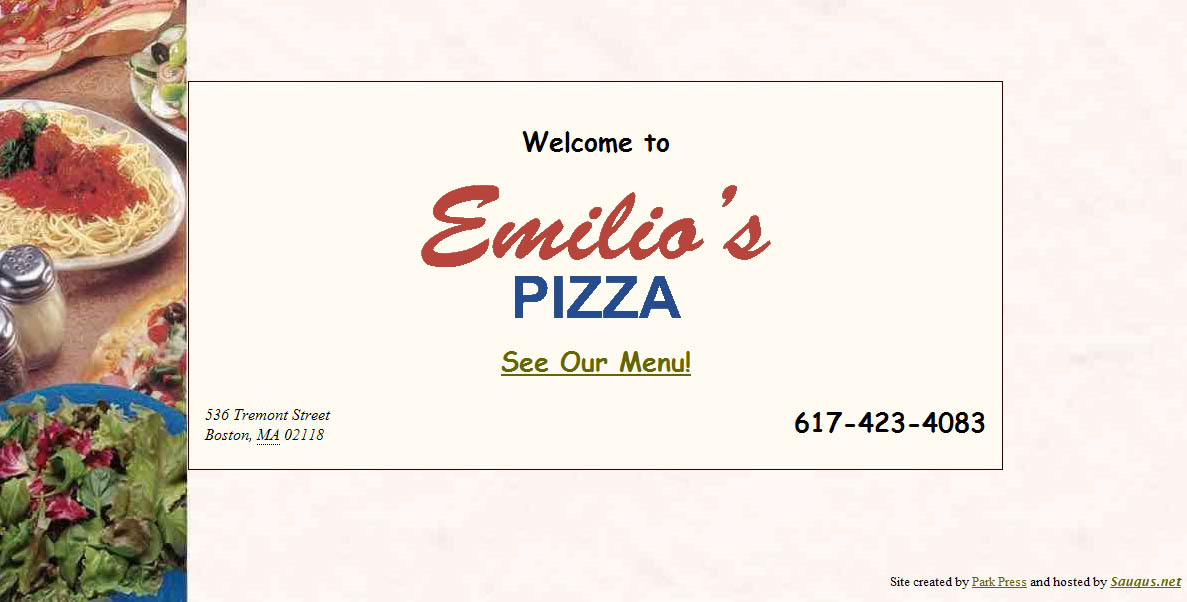
I live not too far from a little pizza place called Emilio's. The other day I was looking through the handful of delivery menus I have and realized I didn't have one for Emilio's, so I figured I'd check online to see what they had.

It took a few clicks to find their site (Google didn't surface it to the top like I'd hope), but once I did, I practically jumped up and down for joy. This one page is their whole website:


(Click to enlarge it, or just visit it here: www.emiliospizzaboston.com)

Okay, so, obviously this is not the prettiest website, but from a usability standpoint I was so happy to see an eatery get it right for once. There are pretty much three main reasons why you'd want to visit a delivery restaurant's website:

-What's on their menu? (And how much does it cost?)
-Where are they located?
-What's the phone number to place an order? (Or for fancier restaurants, to make a reservation)

What does the site for Emilio's offer? A direct link to the menu, their address, and their phone number in large text. No marketing gobbledygook statement from the owner. No pages about atmosphere. No unintuitive naming conventions (everyone knows the word "Menu," so calling it "Food" or "Cuisine" or something cutesy like "Tasty Nibbles" just ends up being confusing).

And furthermore, finding the menu didn't require me to click a location, then click a time of day (brunch, dinner, etc.), then click further into another sub-set of pages for "appetizers," "entrees," etc. I just got the whole menu right away, which is exactly what I wanted.

There are definitely more things the site could offer that would be helpful - hours, a link to a map next to the address, maybe a picture or two of the place (and if it was a fancier restaurant, probably information about reservations and maybe some press reviews), but the essentials were right there. It could also certainly be more visually appealing, but the fact is I found exactly what I was looking for within a split second of landing on the site, which is worth so much more than looking pretty.

Wednesday, October 21, 2009

Progressive disclosure: making decisions easier and more satisfying

I'm not sure if I've directly used the term on this blog before, but the concept of "progressive disclosure" is (in my opinion) a very important part of good design for any website or application. A good design will help the user find what they're looking for easily. Some people interpret this as meaning you should present up-front every possible piece of information they may need or want. In reality this just confuses the user. Imagine if, when you landed on Amazon's website, you were given a full list of every single product with full product description all on the home page. It would be completely unwieldy and almost impossible to find what you really want. Does "everything up-front" still sound like a good plan?

Progressive disclosure tells you that the best way to get people the information they want is to provide just enough at any given point to help their get to their desired result. To continue with the Amazon example, let's say you wanted to buy a Samsung HDTV. In our "up-front" example, you'd have to scan through an unwieldy page with millions of products to find what you want. Instead, progressive disclosure lets us get the shopper to Samsung TVs by clicking through a hierarchy. "Electronics," then "Televisions & Video," then "Samsung" is highlighted as a brand.

Furthermore, when you land on the Samsung page, you don't just see a text list of products or a full spec sheet for each product. You see each product with its name, an image, its price, and its consumer star rating. You're not given the full list of specs and item description for each item, but you're given extremely quick glances at three major pieces of information - aesthetics, price, and quality - which can then help you narrow down to the selection you want.

There are a lot of other ways of using progressive disclosure that aren't just hierarchical. It is helpful also in stepped processes, such as a shopping cart checkout (often you'll see steps shown, such as "Choose Payment Method" and "Enter Shipping Address," with your current step indicated). This lets the user know what's coming next and how long the process is.

You can also use the concept for things like optional features, such as when you are uploading a photo to a site. You may just want to put the photo up and leave it at that. Or maybe you want to add a caption, or tag people in the photo, or edit the photo, or assign it to an album. Having all these options shown up-front can be overwhelming, particularly to the user who just wants to put a photo up right away, a better method would be to make the most commonly used options visible and then hide some of the less-often used features behind a tab or link called "Customize" or "Edit" or something similar.

If you are already in the user experience field, this is probably nothing new. But it seems a lot of clients are frequently unaware of or even fearful of the concept. "I have this great [product/event/etc.] with all these amazing features and aspects to it, I want people to get excited and know all about how awesome it is! Why wouldn't I tell them all about it as soon as I can?"

The answer is that it doesn't help you if you overwhelm or turn off your potential audience. The above quote comes from a perspective of what the company/organization wants, not what the customer does. What your customers probably want to do is figure out what they are interested in, and then learn more about it. (How would you feel if the moment you walked into a car dealership, the dealer gave you a stack of spec sheets and owner's manuals for every car on the lot before you'd even looked at one? Wouldn't you rather find some cars that interest you and then get ask for more information?)

On any given page of a website, ask what the purpose of the page is and why the visitor may be there. Is it a list of products? They are probably there because they are trying to decide or find a product they want. Provide just enough information to get them to a good match, and then on that product's page give them the full run-down.

There are a lot of adjacent concepts that are relevant as well. "Information scent" is the practice of making sure links are providing just enough information to make the user feel like they are on the right track. And the "paradox of choice" is a concept that it is typically much easier, and much more satisfying, to make a choice from among a handful of options than hundreds of options. You could show 512 choices on one page, or you could add a measly 2 clicks to the process by placing a couple hierarchical categoies of 8 options each, giving your customer a much happier path to their goal.

Don't be afraid that you are going to lose a customer by making them click a few times to find what they're looking for. In reality, you are creating an easier and more satisfying route to guide them.

Monday, August 10, 2009

Offer an answer before the question gets asked


I'm going to give Bank of America a thumbs up and a thumbs down for two recent changes that raised my curiosity.

First, the positive. Bank of America (and a few other accounting/banking sites I've seen) seem to be switching to sign-in process that involves entering your username on one screen, and then your password on the next screen, rather than doing both at once. I don't know the research behind this, but my assumption is that this must be a more secure way of managing the login.

However, the first time I noticed that I wasn't being asked for a password, I got concerned. Did that mean that now someone only needed my username to access my account? It raised an alarm. However, right below the username field I noticed a link that said "Where do I enter my passcode?" Even without clicking the link, my concerns were relieved, because it was clear just by providing the link that I would, indeed, enter my passcode at some point to sign in. This is an example of smartly predicting a user's question and providing an answer without them having to ask. It saves the company time and money by reducing customer service requests, and it reinforces the user's confidence by being transparent and anticipating their questions.

Now the negative. I recently deposited a somewhat large check in my account. The pending deposit showed up immediately on my online banking. A few days later, however, a negative "deposit hold" for a slightly different amount appeared. Had it been the identical amount to my deposit I would have been less worried, but the fact that it was a different number, and that it was showing as a separate debit to my account rather than just a note on my original deposit, had me concerned that someone had somehow erroneously withdrawn that money from my account. There was no additional information, and even a search through customer support gave no explanation of a "deposit hold." I suspected things were probably fine and it was just an odd line-item while waiting for my deposit to clear, but to be sure I sent a message to customer service. They eventually confirmed that it was just a note until my deposit fully cleared and not to be worried.

However, they missed two key opportunities to provide information in advance, left a customer worried for a few hours, and ended up expending the time/cost involved in responding to an individual customer request. Had they included a clearer note with the "deposit hold," or even at least had an easily searchable answer in their customer support, they would have saved money and prevented any cause for concern.

I've seen similar examples of anticipating questions/concerns online, such as ING Direct adding a simple disclaimer to accompany a slight site redesign: "We gave our site a minor facelift. So if you notice anything different after you sign in, don't freak out. You're in the right place." Another smart move.

Anytime you are designing for the web, it's smart to brainstorm what questions your users might have, and to make sure the answers are provided or easily findable in advance. It's a win-win addition.

Monday, June 29, 2009

Typical can be good

Anyone working in a creative field will feel, from time to time, a little bored. It may feel like you've done the same thing before, and it feels like you're going through the motions. "This just feels so typical." So you try to shake things up by doing things differently, by starting from scratch, deliberately avoiding the way you've done things before.

That's good, right?

Well... not necessarily, particularly in web design.

While creative people may get bored, most people -- your consumers -- tend to resist change. Change is uncomfortable and unexpected. We operate on muscle memory a lot -- most web visitors know to click a logo for the home page. Most people know how tabs work. Most people understand a dropdown menu.

When you start changing those fundamentals, you're forcing people to learn something new, you're breaking well-entrenched habits, and you are putting your visitor in a position of unfamiliarity.

You can try to push past the typical in many aspects of design, just don't forget that the visitor is probably coming to your site to get something done, and they will accomplish that better if, at least at the interaction level, the design follows standards they are familiar with and have used before. Typical is often actually the best way to go.

Monday, April 13, 2009

The road sign metaphor


I've mentioned before how I think road and highway signs are a really interesting example of usability in action -- they have to be extremely clear, concise, and informative, and it is literally a matter of life or death in some cases (consider a world without "stop" signs).

I've begun using them as a metaphor for web design in the hopes of making it easier for clients to get in the mindset of their site visitors. We'd all like to believe that people coming to our website are deeply interested in our materials and want to read everything we have to say about them. Unfortunately, it's much more accurate to think of your site visitors as ruthless hunters with non-existent attention spans who are scanning for relevant content rapidly, and are willing to toss you aside if they don't see what they want in 2-3 seconds (note, that 2-3 seconds is actually borne out in testing -- that's about how much time you have before someone hits the back button and leaves your site altogether if they don't see what they want).

So that's all well and good to get that in your head -- your visitors want everything fast and easy, and want to do as little reading as possible -- but I think you need to add a little more to the equation in order to figure out how to deliver that content.

That's where road signs come into play.

When you are driving down a highway at 65 MPH, it's generally not that hard to read road signs. They typically do simple things like list the name of a place with an arrow, or they indicate with symbols and short words whether there is food, gas, lodging, or other amenities available at this exit. A road sign wouldn't say "Turn right at the next exit if you're heading toward the greater metropolitan Toledo area, where we have a number of fine hotels and dining options for the whole family." It might simply say "Toledo" with an arrow, as well as "FOOD" and "LODGING" icons. Those thirty words have been boiled down to three words and an arrow. Was any valuable information really lost? And furthermore, if you were flying down the highway, would you have even gotten past the first few words before the sign was gone behind you?

This is a good way to think as you construct your site, particularly when it comes to navigation and basic site structure. You want to pick "content-heavy" words -- typically short words that clearly indicate the content they will lead to. And just as a signpost with 25 signs is going to be harder to parse than one with 5 signs, you want to keep the number of options to a minimum.

This is not to say that you should avoid writing sentences at all -- it's important to keep prose available, but make sure it's where it counts. You don't need to describe in detail how great your parking garage is, but you do need to provide directions that tell you how to get there. Conversely, if someone is trying to pick your next book to buy online, a simple title, author, star rating, and genre is not going to be enough -- a brief prose description of the plot, potentially with quotes from reviewers, is probably going to do a lot more to sell the book than just providing the bare bones. That said, providing a quick look at the genre and rating information on a previous page may be all you need in terms of navigation to get that visitor to the full product page.

If you're not sure how to set up the text and navigation for your site, it may be helpful to stop and thinking of your visitor cruising down the freeway, looking for a particular destination. What would they be able to quickly read on a road sign that would make them turn in your direction?

Wednesday, March 11, 2009

One great logo


This is apparently a few months old, but I just spotted it for the first time this past week. Boston has long struggled to make the Downtown Crossing area into a nicer shopping area/pedestrian mall, and their efforts have largely been met with a "meh."

If this logo is any indication, they are moving in the right direction. I generally think overly clever logos with overlapping words just end up looking confusing and overwrought, but in this instance the words overlap brilliantly and the T-as-cross really fits perfectly with the "Crossing" aspect.

I haven't been this impressed by a logo in a long time!

Pointless "innovation" (the new iPod Shuffle)


Before I began this blog, I attempted a different style of blogging elsewhere that was intended to focus more on good/bad examples of design. My first example of good design was the iPod Shuffle. The multi-colored clip-on items were only a little bigger than a postage stamp and I loved them. They were perfect for the gym, or if I wanted to ride the subway in town for a night out without having to stuff my pockets with an iPod.

Today Apple announced the new version of the Shuffle. It is not all that drastic a change, and there are some new features I like, such as the ability to hear the song/artist name spoken to you while listening and the addition of controls to the headphones.

But most of the other changes seem either pointless or actually negative.
  • The Shuffle is now even physically smaller than before -- but was anyone even asking for this? The previous Shuffle was tiny as it was -- it weighed less than an ounce already. I can see the benefit in reducing weight with slightly larger objects, even something as small as a cell phone can benefit from being a few ounces lighter. But when you are changing something to be tenths of an ounce lighter, will anyone care?
  • There are now no buttons on the Shuffle itself. The idea of adding inline buttons to the earphones is great -- but making that the ONLY way to interact with the device is a mistake. You are now requiring your audience to use only specially designed earphones with the device.
  • The size of the storage has increased to 4GB. There really isn't any harm in adding more storage, but for many people the 1GB (or 2GB) was probably sufficient. And the new 4GB is over 60% more expensive than the old 1GB. Is that price increase worth a memory jump that many may not need? For now, the old 1GB version is still available, but it will undoubtedly be phased out.
  • This is purely cosmetic, but -- why only silver/dark gray options for colors? Apple has an affection for clean lines, which I love, but when your object is about half the size of your pinky finger with no buttons or interface on most of the surface, you risk going from "sleek" to "lifeless." A little color would at least allow some personality.
I have to wonder, why did Apple bother? The voice reading of tracks was a very nice touch, but otherwise there is little innovative here. In terms of convenience, the size of the Shuffle was no longer an issue. The area probably most asking for innovation is the headphones now -- wires still get tangled, they are aesthetically unpleasing sometimes, and can get caught on things. Why not focus their innovative efforts on something like making wireless earphones standard? And if that is a difficult goal, why even bother at all with tweaking something that was already extremely effective as is?

Tuesday, March 10, 2009

Trust and faith in design

It's a cliche to make fun of older generations and their discomfort with technology, but that stereotypical technophobia is really just an extreme version of something all of us probably feel at some point or another: a lack of trust and faith in the system we are using.

What does this button do?
I remember having someone ask me, "What do I do to submit the form? Do I press the submit button?" The answer, to most of us, is "yes, duh." But what if the question is less clear? Navigational terms don't match what you thought you'd find. Something you thought was a free trial asks for your credit card and doesn't explain why. A link that seemed obvious takes you to a completely unexpected page or site. In each case, the design is playing fast and loose with the user's trust and faith, and as a result, is probably failing the user's needs.

Anticipate the next step
Good design anticipates what the user will want. On your homepage, offer links to the things your visitors most likely will want. Look at the search terms people use to find things on your site, and make sure your navigational terms match them. Whenever you ask a user for information, explain why you want it and how it will be used.

Explain yourself
One place that I frequently see abused is the "contact us" page -- many sites will ask for name, address, phone number, email, sometimes even fax number and company, and in worst-case scenarios, they'll even tack on some "survey" type questions -- even if all you wanted to do was maybe email them to ask about the release date of an upcoming product. In that scenario, literally the only piece of information the company actually needs is your email address. So why ask for the moon? Is it because your designer just used a "contact us" template and didn't really think about what that means for the user? Is it because you are adding me to a database you are going to sell to third parties? And even if all you do ask for is my email address, will you start sending me unwanted email newsletters without asking? Tell the user up front, and let them make the informed decision. (Even better, in this scenario, you could save the user and yourself time by having just clearly listed the product release date on your site in the first place.)

Expect questions, and provide answers
One thing I try to do when starting any project is just write down a list of questions I think a user/visitor may have, based on the type of site/product and the customer base. I try not to get overly specific but the questions should not just be the broad ones either -- for example, on a shoe site, I wouldn't write out questions about a particular pair of shoes, but I might write out questions about broader types of shoes, or questions that might apply to any individual pair of shoes.

Prioritize and group logically
From there, I try to group the questions logically, and see if they align to particular terms. If possible, prioritize the questions as well, and make it easier to find the answers to those more essential questions. This is also where some statistical data can come in handy -- search terms used, frequency of visits to particular areas of a site, volume of support emails/calls about particular topics. Maybe half the visitors to your site are just trying to find your address, and already know all about your product/service. You could have a beautiful, highly usable presentation of your product line, but if that address is hard to find, you are failing half your audience from the start.

I've found that structuring a website around this is a good way to meet user's needs, and a lot of this work can inform other decisions down the line, and make it easier to work in changes/new ideas -- just follow a mini-version of these steps (asking questions, grouping them, working out logical answers) and see if your architecture already accommodates these changes or if you need to restructure.

By anticipating everything the user will want, and providing easy answers to key questions and presenting them at logical points, you build that trust and faith. You're more likely to have a happy customer, and you reduce anxiety.

Wednesday, March 4, 2009

Usability Case Study: Comcast


I've heard a lot of horror stories about Comcast -- terrible customer service, too expensive, half-assed installations that sometimes end up destroying walls -- but when I moved this past weekend into a new apartment in Boston, I had to say goodbye to RCN and sign up with Comcast.

I try to keep an open mind, so I was willing to let the bad stories I'd heard recede, and look at my Comcast experience with out prejudging. Some of the experience was bad, some was good. Overall, for Comcast, this can serve as a case study in how they could improve their sign up process.

1. Signing up online
The first thing I did was visit the Comcast website and try to put together the package I wanted. We needed cable and internet, but no phone, and they did have a bundle for those two things. But they only had ONE bundle -- oddly enough, with the most basic cable offering they have, which excluded a few too many channels for my liking. When I tried to build my own bundle with the next level of cable, any bundle savings were erased, and there was no option to upgrade the basic bundle. Here I was, a customer wanting to spend MORE than the basic bundle offered, but the online system offered no way to do this. I gave up.
Verdict: FAIL
How to fix it: System should genuinely show all options, and make it easier to customize your package.

2. Signing up by phone automated prompts
Defeated by their website, I decided to just call to set it up. The very first thing that comes up in their automated prompt is "Enter the phone number where you would like service." This is a problem on many levels. First, Comcast offers phone service, so you could conceivably NOT have a phone number yet for the place you want to have it installed. Second, and here's what applies in my case, I am a cell-only person and do not have or want a landline. So the place where I want service has no phone number. Hoping to get to a prompt that makes more sense, I hit #. It asks me for my number again, and I hit # again hoping I'll get an operator or something. Instead it reads me back the phone number of the line I am calling on, assuming it is where I want service. Since I am calling from a landline at work, this is definitely not the number I want, so I hit a series of other buttons hoping to get out of installing cable at my workplace. Eventually, I somehow get a live person.
Verdict: FAIL
How to fix it: I suspect this may be the case, but a simple change in language could go the distance -- "Enter the phone number you would like to use for your contact information. If you are ordering phone service as part of your package, press *." This addresses both problem scenarios -- you don't have a landline, or you are adding a new landline.

3. Signing up by phone with a representative
Once I finally got a representative, which didn't take very long (no 30 minute wait for me), the process actually went quite smoothly. The man was helpful, understood exactly what I was asking for, explained the pricing and the promotional period, set up installation, it was a breeze. The only thing I realized after the call was that he had never taken my email address, which would've been nice so I could've gotten some email confirmation. But, not a big deal.
Verdict: SUCCESS

4. Installation
The installation was supposed to happen between 11am-1pm, and just as scheduled they showed up just after 11am, even though there was a huge snowstorm. They installed everything quickly, and were very nice -- they even took my roommate's old cable box with them to save him the return hassle.
Verdict: SUCCESS

5. Setting up internet
The one thing I had to set up on my own was the internet. They brought the modem but I had to activate it. Which would've been a breeze, except the first thing the system asks for is your account number. Since I had never been asked for my email address, I had no email record with that information. I looked through the documents the installers brought, and nothing had any personalized information -- no account number there either. I had never been given my account number! And the prompts offered no "don't have your account number?" prompt like many online services offer for people in my shoes. I had to call to get it, and this time I did have to wait about 10+ minutes on the phone to get a representative. Fortunately they gave me my number quickly, and then I was able to complete the setup.
Verdict: MIXED
How to fix it: Installation should come with some sort of confirmation sheet or other personalized document including your account number. But ideally, the internet activation should offer a "don't have your account number?" link that lets you enter in other information (SSN, phone number, address, etc.).

6. Ordering TiVo service on the website
Once I got everything set up, I tried to hook up my old TiVo box and realized that my new fancy HD setup did not work with my old school TiVo -- and the TiVo couldn't even communicate with the cable box to change channels, making it useless completely. I had seen billboards around town advertising that Comcast had partnered with TiVo to offer that service. Since I hate typical cable DVRs, I thought this would be a great alternative. I go online to the Comcast TiVo site, and it asks me for my zip code to check availability. Success! It is available locally (which makes sense, given the billboards). Now it's redirecting me to the order page, and... "This package or service is no longer available." What? In fact I can't find anything on the site to actually order the service. Which I know they are offering.
Verdict: FAIL
How to fix it: See #1. Don't tell me you have a service and then don't let me sign up for it. Get your system up to date, Comcast! Furthermore, include pricing information up front -- the page for TiVo did not include this.

7. Ordering TiVo via live chat
Just to try one more avenue of communication, I decide to use the live chat function rather than waiting on hold for a phone representative. No one is immediately available on the chat, but it does tell me what number I am in the queue, which is nice. It takes about 5-10 minutes for someone to show up, but since I am online I am able to do other things so I don't mind the wait. The representative is very helpful, answers my questions quickly, and I am surprised to learn that to get TiVo HD I do not need to buy a box or even pay an expensive initial setup fee, and the monthly fee is actually less than I was paying on my old TiVo. A pleasant surprise. The installation is set up quickly, and I'm done.
Verdict: SUCCESS

Overall, I was impressed by the actual human interactions -- people were friendly, and although not every phone call/live chat was answered immediately, the waits weren't too terrible. As for the website, it proved almost completely useless. It did not show all the options available, and in the case of TiVo, didn't even show the service at all. Even worse was the automated phone system, which started of on such a wrong footing that I got worried I was going to accidentally set up something at the complete wrong location.

Now I am not someone who hates using websites and automated phone systems to complete transactions -- in fact I prefer it greatly. If I can set something up without having to talk to someone, I am happy, as it saves me time and I can do it whenever I want. And, as far as I know, it greatly reduces the cost to the company. One client I worked with once mentioned that it cost them $14 per call due to the costs of maintaining that system and paying for call representatives. It would be to Comcast's extreme benefit to improve their system. And considering they are a company offering internet service, it speaks quite poorly of them that they cannot even offer a successful online interface.

Now let's just see how billing goes...

Friday, February 13, 2009

The economy and usability fail each other... again.

In this story from CNN about the economic stimulus bill, there is a quote from a Republican which has a lot of validity to it:

Some representatives expressed frustration over how little time they had to read the 1,000-plus page bill.

"You can't be serious. This would be humorous if it wasn't so sad," said Rep. Tom Price, R-Georgia. "What's in it? Have you read it?"

I blogged before about how usability could improve the mortgage process, and I think it could stand to do a lot to improve how bills are handled as well. No doubt the fine print of bills are necessary, but, at some point you have to be realistic. No one has time to read 1,000 page bills. It would take, probably quite literally, a few days straight of reading to get through it, let alone fully digest and understand it.

And furthermore, it reduces transparency -- we do operate in a representative government where we don't expect average citizens to have the time (or inclination) to know everything about every bill, law, and regulation -- but sometimes it would be nice to know exactly what our reps are doing.

So why not have a straight up bulleted list up front of all the items contained within? It could look as simple as this, or even break down each section a little further:
  • $12 billion for street repairs (p. 193-195)
  • $27 billion for environmentally friendly fuels (p. 344-350)
  • $19 billion for school construction (p. 507-524)
  • And so on...
Of course, that may oversimplify things, but if you're fairly certain you're on board with street repairs, but not so sure about environmentally friendly fuels, you can focus on reading the fuels section.

This isn't about being too lazy to read, it's about realistically improving the decision-making process. Big long documents shouldn't be impressive -- clearly written and easy-to-understand documents should. If you have to have the former, the least you can do is provide the option of the latter.

(Note: I'm not making any commentary on whether or not I agree with the Republicans' stance on the stimulus bill, but I am more than willing to highlight a valid point!)