Monday, January 25, 2010

New work up: JohnCorvino.com


http://www.johncorvino.com/

I met John Corvino in person several months ago, and after learning his partner worked in the same company as I did (albeit in the Detroit branch), we stayed in touch, and he asked me to take a look at working on his website. John is a prominent speaker/writer/lecturer on moral issues surrounding gay rights (hence the moniker "The Gay Moralist"). In fact, he debated Maggie Gallagher, president of the National Organization for Marriage, just last week.

For his site, he wanted to not only give it a clean, vibrant visual makeover, but also make it easy to update and provide an automated way to sign up for an email newsletter. I've found that virtually all clients at this point want the ability to update their sites themselves, and it can be tricky to build a site with a content management system that does not require any coding knowledge on the part of the person doing the updates.

For this execution, I did a slight restructure of the information architecture, and then used WordPress (which I also used for my 2k50 site) for the implementation. I wrote a visual theme for it from scratch and used the "Pages" and "Categories" features to organize the content. I also figured out a few other cool things -- I managed to sync up an RSS feed of the columns John writes for 365gay.com so they appear on his site automatically (and in the proper category). I also used a combination of WordPress plugins and Feedburner to build a free, automated email newsletter for him -- all within the same admin interface as updating site content.

I am finding that WordPress has a lot of benefits (although there are some unfortunate issues that require workarounds), and will probably continue using the service for similar clients in the future.

Check out John's site at http://www.johncorvino.com/.

Friday, January 22, 2010

Marketing-speak is killing me

A lot of my work involves looking at other websites to see what's going on in terms of structure, interactivity, etc. And one thing that I keep noticing is just how often websites are plagued by utterly-meaningless, corporate marketing-speak. Here's one example from a financial institution's home page:

What does that mean? I will give the copy writer a little benefit-of-the-doubt -- they at least understand that a major issue people have with financial institutions is trust, and being valued. The problem is that this says absolutely nothing about how they plan to establish that trust or "commitment." There is no action to take here. There is no proof of their claim. It would be like having a slogan that says "We are good" and leaving it at that without an explanation of why. Note that they don't even tell you what they do here -- the only thing that establishes any sense of financials is that the two guys in the generic stock photo are in suits. But they could be lawyers, politicians, who knows. And yet this is the largest piece of real estate on their website's home page. Who would be convinced of anything here?

I'll contrast this with a better example from a similar company:

This is a little better. I could still do without yet another generic stock photo, but I know that research shows people do respond to photos of other people, and at least the photo does roughly connote either retirement or saving for your child. But where this site gets it right is that it is establishing a bunch of things with its headline and copy very quickly. It tells you what the company does, how that can help you, how they accomplish that (including a product name), what it will mean for you, and then invites you to action. It's not just saying "we care about you." It's saying "we understand what your problem is and we are offering you this solution." Much more effective.

It's the old "show, don't tell" adage. It's a lesson too frequently forgotten.

Tuesday, January 19, 2010

Prioritizing Content

The field of "information architecture" is essentially about organizing. Where do things go? What's the hierarchy? You can't answer questions like this without first figuring out your content and prioritizing it.

This is extremely challenging for a lot of clients. It's like asking them to pick a favorite child. How can you say that product A is more important than product B? Or that one type of information is more important than another?

The reality, however, is that prioritizing is not optional. Even if you somehow designed a website where literally every single piece of information was given equal weight, you'd still have the bias of the order in which that is presented. Something neutral like "alphabetical" now gives weight to A-named things. Abandoning any particular order and randomizing every time you load a page now completely leaves the user helpless as they have no way to find anything as there is no structure anymore. You have to make a choice in terms of priority.

The good thing is that you don't have to make these decisions in a vaccuum. There are two key methods to determining priority: user goals and business goals. Fairly basic site statistics can tell you what your users are doing (more advanced analysis could of course give you additional insights). If 20% buy products, but 60% go to the help forums, you could probably surmise that the majority of your site visitors are existing owners of your product who come back to look for assistance (it also may suggest that your product has some problems!).

But hold on one second. If you followed that priority path, you would be greatly diminishing the prominence of shopping for your products. This may match user behavior but is probably not a great match for your business goals -- no doubt your top priority is selling your product. And this is where that delicate balance of both comes into play.

The key to managing both sides of the equation is understanding that users looking for particular things tend to exhibit different behaviors. Most people will probably expect that the main area of your home page will be promotional in nature. If they are coming in with the intent to get help with your product, they will probably start by looking in your menus, footer, or other contextual link areas searching for key words like "support," "help," or "FAQ." You can cater to them by making such a link highly visible and easy to spot, without sacrificing your promotional space for products.

Conversely, someone who is in a "shopping" mindset may skip your menus altogether and interact directly with your main content area. Further prioritizing here (showing the most popular products, for example, or the best new discount) gets that user to the content they're looking for right away.

This is all rather high level, I'll admit, and prioritization decisions are often much more difficult than this. Take, for example, a website with a homepage that has three clearly defined areas for promotions. If these three areas are different in size and location, you can probably give a clear order to their visibility. Let's say you have a large banner, a medium-sized tile area, and a small text link, going from "most visibility" to "least." Now let's say you have three new promotions coming up simultaneously. Your first instinct for each may be to give them all top priority. They are all important, right? Can't we just make three large banners? You could... but then your website would start becoming a monster with no organizational structure. It's never a good idea to re-structure a website based around a single one-time occurrence, unless it's something truly huge (like, you're going out of business, for example). You confuse return visitors and disrupt the visual "brand" your site establishes.

It becomes so much easier to solve design problems when you get comfortable with the idea that not everything is going to be equally important, and that the way to give visibility to content may differ based on the type of content you are presenting. Smart prioritization not only makes your website easier to navigate, it can increase user satisfaction and supports your business goals by steering people to the content they want while also giving them an easy path to turn from visitor into customer.

Friday, December 25, 2009

2k50: An Experimental Project


I've been working on a personal side project called "2k50: The 50 Best Songs of the Decade," which just went up a few days ago. I spent weeks compiling my 50 favorite songs of 2000-2009, and am now posting 5 more every day until December 30 (50-26 are up as of this writing). This project also served as an opportunity to further explore Wordpress as a site management solution. It worked wonderfully, and has given me a lot of insight into how to build sites that clients can update themselves even if they don't know how to code. Furthermore, I even learned a new thing or two about CSS layouts. This may not mean much to those who don't know coding, but I was able to design the site using solely text and CSS-scripted boxes of color -- this is a great technique in general as it not only makes pages load faster, but improves searchability.

Check it out: 2k50: The 50 Best Songs of the Decade

Monday, December 21, 2009

New work up: Duracell.com


A few months ago I was on the team redesigning Duracell's website, with my focus on the user experience side of things. The wireframes I worked on (which were partially based on designs another interaction designer had created - I certainly can't take 100% credit!) were used by the creative and tech teams to implement the site. I'm pretty happy with the end result!

Visit Duracell.com

Tuesday, November 24, 2009

Removing ego from design

One of the most difficult aspects of any web design project is reconciling the goals of the designer with the goals of the audience. (And by "designer," I am including everyone involved in the design process, including the client, the design agency, etc.) This is so difficult because the goals of the designer include so many facets -- the client wants to get more money coming in, the agency wants to please the client to get more work in the future, the creative director wants to wow other creative types with his/her vision and maybe win an award, etc. And amidst all of that as well are political power plays, internal arguments, and some "selective hearing" when it comes to research and statistics that don't support their individual goals. (I speak of no particular agency or experience here -- these are accumulated observations.)

The whole rigmarole can be a bit exhausting and it is very easy to get caught up in the "designer" side of things. It all seems quite serious - to step back and think about the fact that people can get into shouting matches over a single word on a website (I've seen it happen) - I don't know, it seems like the perspective is off. People take these battles very personally, and fight for things because they want them, or because it means something to them, and it's easy to forget that all that really matters is whether or not somebody going to your website is going to have a good experience.

This is why I've found it so valuable, in my own work, to start viewing the work I do as completely separate from who I am. Much of what I design is based on research - knowing what works and what doesn't - but there is not enough research in the world to make every decision foolproof. If something was a subjective call, or I designed based on a hunch, and someone takes issue, I'll explain my viewpoint but recognize that if I don't have an empirical study to back it up, it's really just an opinion.

In addition, when working in a group environment, letting go of ego can make the brainstorming and overall creative process a lot more open. An idea prefaced with "this may be stupid, but..." could end up being the best idea of the day, while one that someone thinks is surefire could be quickly tossed out as the details are thought out further. When ego is involved, the initial "stupid" idea might never be brought up for fear of a negative reaction, while the "surefire" idea might be fought for tooth-and-nail to the detriment of better options. Letting go of ego - where you perceive comments about your idea as a comments about you - switches the emphasis to the ideas, not the people.

This ends up being quite liberating in the long run, because not only does it make it easier to edit and adapt your design as more learnings come in, it also makes you focus more on what will best serve the end user. And in the end, that's really the truest measure of a successful design.

Friday, November 20, 2009

The best restaurant site I've seen in a long time

I live not too far from a little pizza place called Emilio's. The other day I was looking through the handful of delivery menus I have and realized I didn't have one for Emilio's, so I figured I'd check online to see what they had.

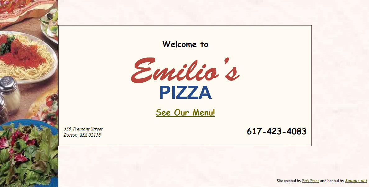
It took a few clicks to find their site (Google didn't surface it to the top like I'd hope), but once I did, I practically jumped up and down for joy. This one page is their whole website:


(Click to enlarge it, or just visit it here: www.emiliospizzaboston.com)

Okay, so, obviously this is not the prettiest website, but from a usability standpoint I was so happy to see an eatery get it right for once. There are pretty much three main reasons why you'd want to visit a delivery restaurant's website:

-What's on their menu? (And how much does it cost?)
-Where are they located?
-What's the phone number to place an order? (Or for fancier restaurants, to make a reservation)

What does the site for Emilio's offer? A direct link to the menu, their address, and their phone number in large text. No marketing gobbledygook statement from the owner. No pages about atmosphere. No unintuitive naming conventions (everyone knows the word "Menu," so calling it "Food" or "Cuisine" or something cutesy like "Tasty Nibbles" just ends up being confusing).

And furthermore, finding the menu didn't require me to click a location, then click a time of day (brunch, dinner, etc.), then click further into another sub-set of pages for "appetizers," "entrees," etc. I just got the whole menu right away, which is exactly what I wanted.

There are definitely more things the site could offer that would be helpful - hours, a link to a map next to the address, maybe a picture or two of the place (and if it was a fancier restaurant, probably information about reservations and maybe some press reviews), but the essentials were right there. It could also certainly be more visually appealing, but the fact is I found exactly what I was looking for within a split second of landing on the site, which is worth so much more than looking pretty.